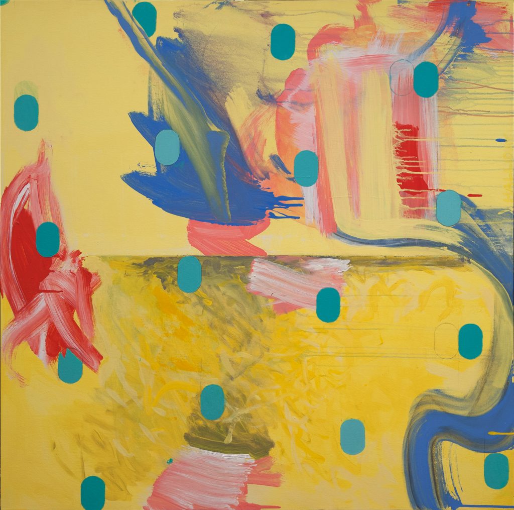
Happy
Happy is a rare find in my recent repertoire. It was created in a period when I was painting darker, quieter works. Happy took me out of my zone and I employed brighter colors and vibrant hues. I transferred my energy and excitement into my brushwork; I was brought to a different state of mind.
In its bifurcated composition, the lighter yellow juxtaposes the darker ochre, creating a spatial relationship between the two. The “blips” of turquoise color float across the canvas, giving the seemingly unstructured composition a sense of order. This can be a reflection of my split of mind, which is in constant negotiation with myself. Often, I just want to be like the colors when I paint them “wet on wet”- they simply fuse together in harmony.
Learn more about the Greater Columbus Convention Center.
Visit the Greater Columbus Convention Center Website.